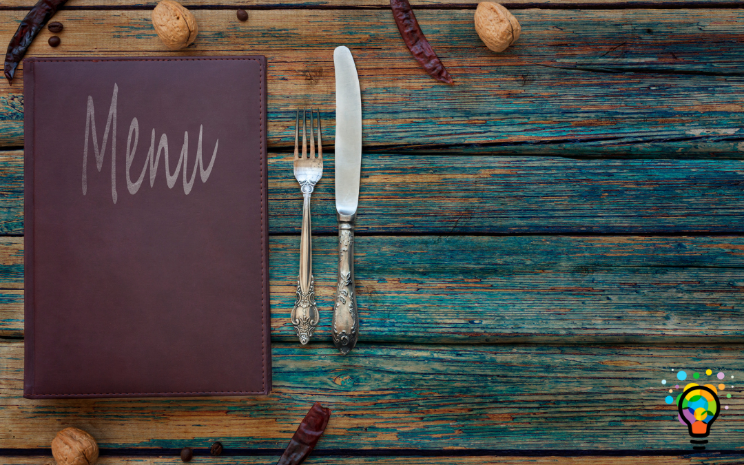
Many successful restaurants around the world understand that the content of the menu is equally as crucial as the design and cover of the menu; this keeps their return value and customer experience top-notch.
A well-designed menu increases a customer’s propensity and interest in ordering from your restaurant. Menu design says a lot about the type of food served at your restaurants. If the menu design is excellent, it gives customers a high expectation for the food they order.
How do you come about a gorgeous menu design? Below we will be talking about some tips you could use when designing your menu.
Tips in Designing a Quality Menu
Before the food arrives, the dine-in experience customer receives most of the time is defined by the menu design. A good menu design is an essential marketing tool a restaurant should possess. It enhances the dining experience of the customer, thereby increasing the restaurant’s profit because customers tend to patronize a restaurant more if the dining experience interests them. Below are some tips on how to design a quality menu.
- Use the Right Menu Cover
Menu covers are not all the same. Unique MCPI has a variety of menu covers, each for a specific purpose. Proper presentation makes ordering less difficult.
For instance:
- A single-panel menu cover is used to offer lunch or dinner specials
- A two-panel table tent menu is used to present desserts or the wine list
- A three-panel cover is used to present breakfast, lunch, and diner at once. This is done using three(3) easily scannable columns
- Use Quality Photos
A 30% sales increase can be attained by merely placing professional-quality food next to your menu item. These photos stimulate the appetite of diners. While fixing these photos, try to avoid visual clutter by restricting it to an image per page.
- Use a Complimentary Font
Fonts used also play a vital role in the dining experience. Times New Roman, Arial, or Helvetica gives a more classic impression. Serif fonts could also be used for headings and dish descriptions.
- Bold Topography
A legible menu communicates the brand of a restaurant. Topography has to do with choosing the right typeface. The typeface type to use depends solely on the amount of text on the page. Using 2 to 3 typefaces helps guide diners through the menu.
- Reduced Emphasis on Currency Signs
Studies have shown that diners are always willing to spend more when currency signs are reduced or even omitted. Currency signs make customers aware of how much they’re spending, and that isn’t necessarily good for business.
Types of Menu Cover Designs at Unique MCPI
At Unique MCPI, we understand that time is very precious to every business owner. Below are classic menu cover designs you could use in your restaurants:
Studies have shown that diners spend a few minutes reviewing the menu. Using the right menu design, your restaurant is bound to stand out and be memorable to the diner. At Unique MCPI, we are specialized in menu cover designing that appealingly presents your dishes. If you have any questions or would like to work with us, kindly contact us today!


